
My Role
UI/UX Designer
Tools Used
Adobe Illustrator
Sketch
Zeplin
Duration
5 Weeks
(Jun - July 2019)
Platform
Responsive Web + Mobile
Overview
The Host Dashboard includes a series of pages for hosts affiliated with Laguro to update their office profile and listings. The listings feature allows hosts to rent out their unused dental spaces or chairs to practicing dentists without offices. Hosting allows dental space owners to obtain a passive income while saving dentists that can not afford overhead costs lots of money.
During my internship at Laguro, I worked on a independent project to redesign the Host Dashboard, closely communicating with the lead product designer, Tina Park on design goals and decisions.
The Problem
The previous Host Dashboard page interface required a refresh because more new content and visuals were needed to reorganize the information architecture to make it more intuitive for dental space hosts to utilize the page and its features.
Goals & Direction
What features do we want to incorporate within the Host Dashboard?
• Ability to adjust host settings to their visible profile (e.g. office availability, pictures, listing description)
• Management of multiple listings (if hosts have multiple spaces or chairs)
• Updating documentation to verify that their license and insurance information is up to date
Ideation: Initial Sketches


Iterations
Ver. 1

Ver. 2

Ver. 3
Design Decisions
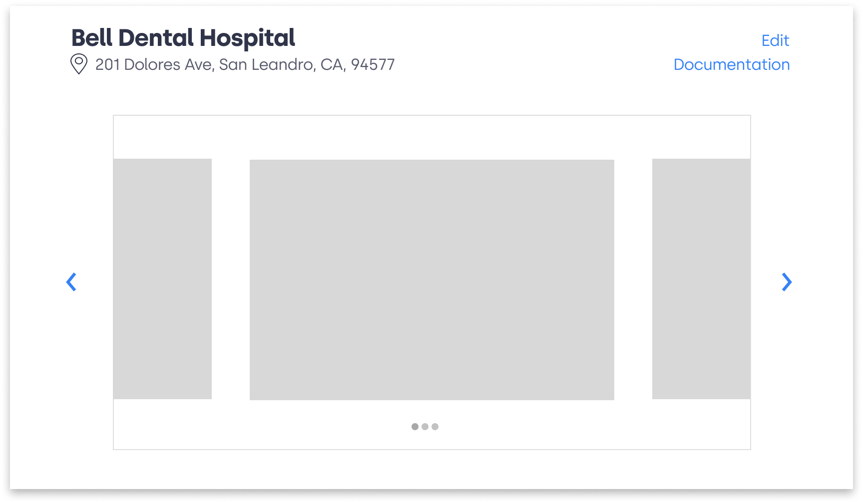
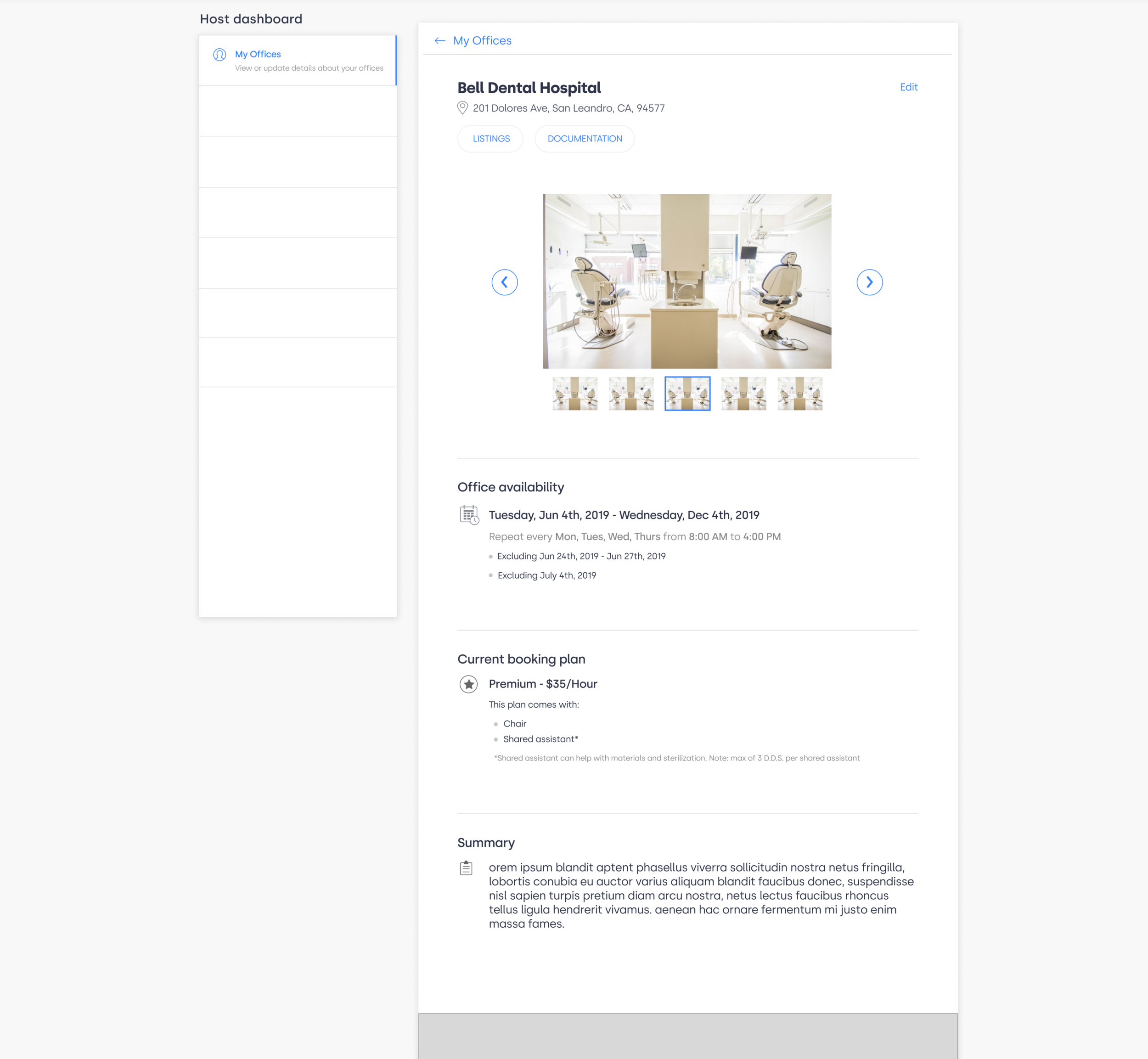
Designed multiple versions to test which type of carousel was most fitting for the web layout
Ultimately went with Ver. 2 because it organizes the pictures in a manner that emphasizes the current picture clearly while allowing users to see a smaller view of all the images in the gallery (Ver. 3 seemed more cluttered and distracting based on usability testing feedback)
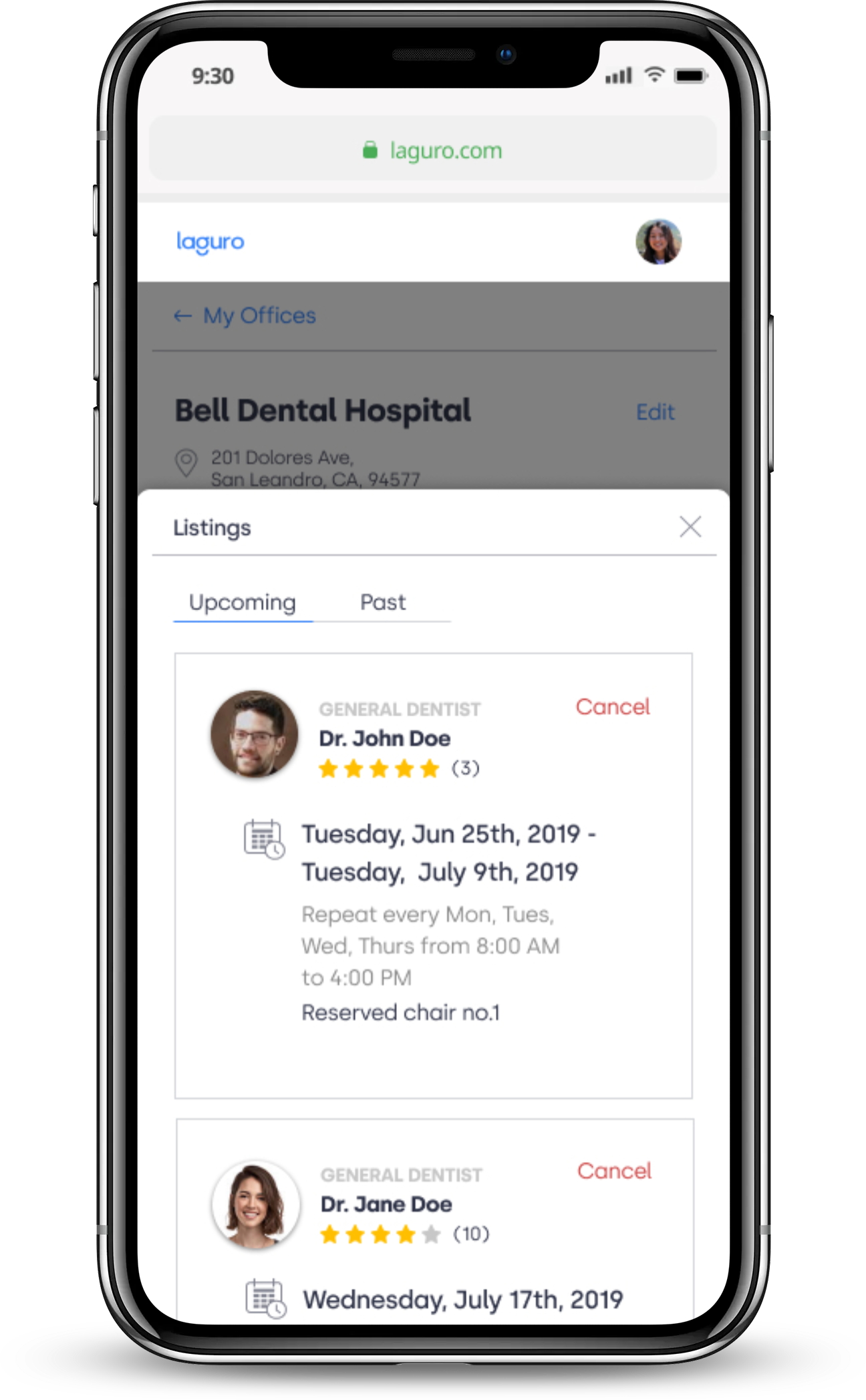
Designing for Responsive Web & Mobile Platforms
Translating web design into mobile design helped to develop a guideline for the overall design. Using a web design for mobile was challenging due to the limitations of the phone screen size. As a result, I had to decrease the size of the text and pictures/icons for better readability on mobile and omitted the dashboard panel to accommodate that.

Highlights of the Final Prototype


Listings
Users may switch between upcoming and past listings and toggle to see or hide payment details
In any case that the host is unable to accommodate the dentist's booked appointment time and date, the host may cancel the listing.
The past listings show bookings from the past and payment details.
Web Design
Mobile Design

Horizontal Scrolling Carousel
This feature allows the host to see which pictures are currently active on the website listing's profile for the dental space
Documentation Button
Shows the host's current licensing and insurance information to verify that they are qualified to host the space
Measuring Impact
The Host Dashboard was handed off to the development team but since my internship ended before it was implemented, I do not have quantifiable data as metrics for success.
If I were there post-development, I would gauge these metrics:
Satisfaction: how satisfied are hosts with navigating through the interface?
Method of Measure: a thumbs-up and thumbs-down rating system that pops up once in a while
Efficiency: how much time do hosts usually take to create a new listing or update their profile?
Method of Measure: tracking user engagement and time per session via Google Analytics
Learnings
Web and mobile interfaces require a different type of information architecture due to differences in size and readability. Designing for accessibility and efficiency for different frameworks are not necessarily the same since there are different considerations for both.
When designing for mobile screens, we are limited by compacting lots of information into a smaller screen which calls for resizing icons, creating an easier means of access, and ensuring that buttons/links are the perfect size to press.
When designing a web interface,it is easier to put in more content, but designers must be mindful about the readability of the page. There needs to be a visual hierarchy since there is more content to sift through.